SimplePractice's settings were overwhelming and confusing. By restructuring the information hierarchy, simplifying navigation, and establishing guiding principles for future settings, we achieved a 90% reduction in customer support complaints.
Company
SimplePractice
YEAR
2022-23
DURATION
6 months (design & discovery)
ROLE
Product strategy
Product design
Information architecture
Discovery
Practice setup within settings is a key part of user onboarding
A key business value for SimplePractice is to reduce administrative burden and enable clinicians spend more time with their clients.
SimplePractice no longer felt ‘simple’
Customer feedback, including support tickets and user interviews, revealed growing complexity. For many solo practitioners, especially those new to private practice, a smooth, hassle-free experience is crucial. However, as SimplePractice added features, the increasing number of settings pages made it feel complicated.
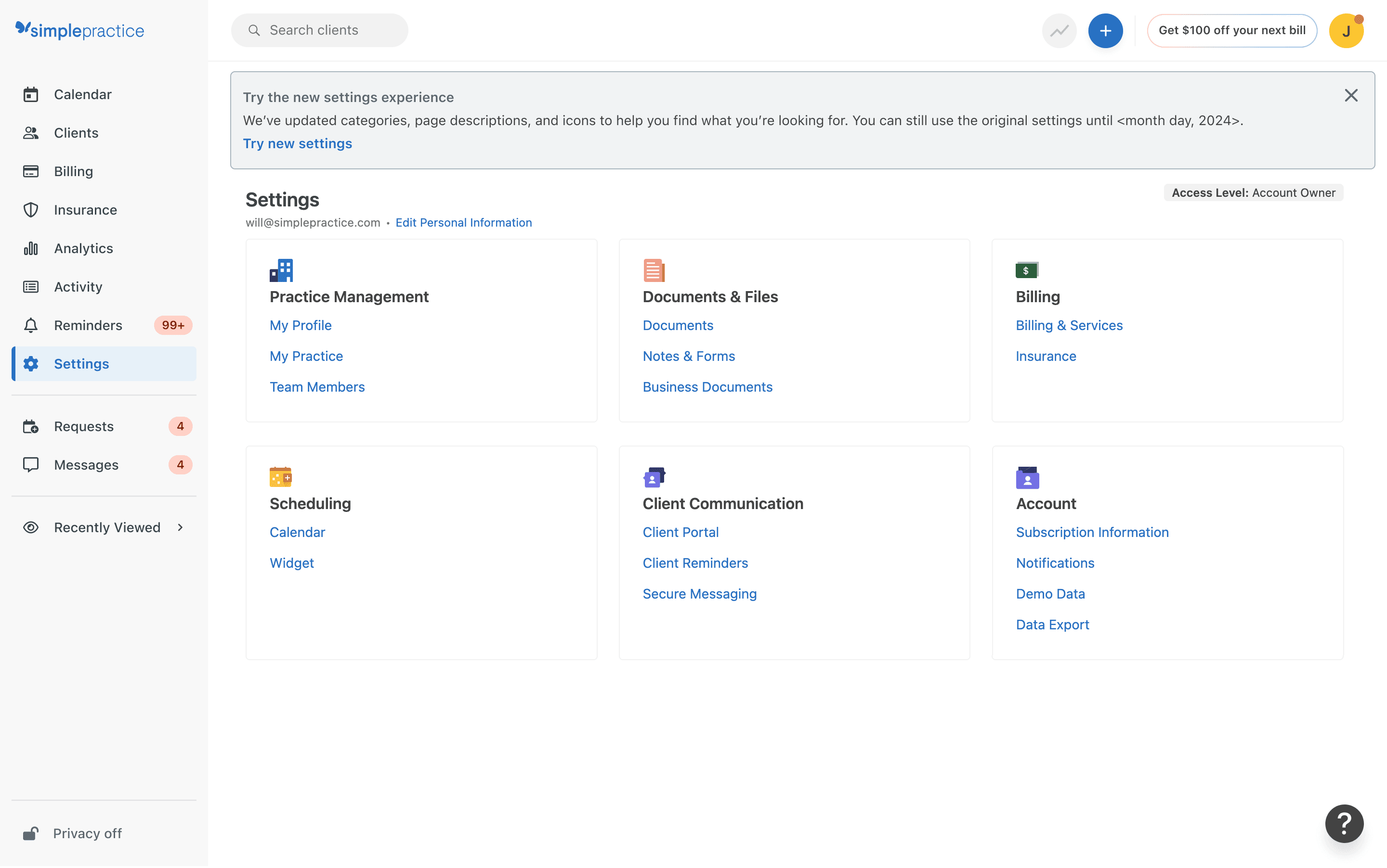
Relevant settings were hard to find
Navigation was nested within often-hidden tabs. Poor naming conventions and the absence of these tabs in the main navigation created an abrupt and clunky experience, forcing users to click through each element.
Settings placement felt illogical
Without common principles guiding their organization within tabs, settings appeared randomly grouped. This, combined with poor naming, made efficient discovery difficult.


User research showed users struggled to locate settings
Relevant settings were hard to discover
User research revealed that our users struggled to find the settings. Users revealed that once setup they often don't go back to settings unless they really need to. However the current experience often delays or derails their workflows because of how cumbersome it is to find what they need.
Navigation within settings were nested within tabs that were hard to discover
Clinicians felt like they were interrupting/derailing their workflow searching for settings. A key theme from our users was the feeling of running around in circles before they found the right settings to work with. This was mainly caused by tabs being hidden from the navigation. However lack of clarifying information, poor naming and lateral navigation further added to this issue.
Nested permissions made it hard to follow or setup correctly
Some permissions within SimplePractice were nested under other permissions making it confusing. There was also a lack of clear documentation around nested permissions within the interface further adding to the confusion. Users often remarked that they did not have a clear sense of if something was setup properly or not. This was one of the major contributors to CS tickets.

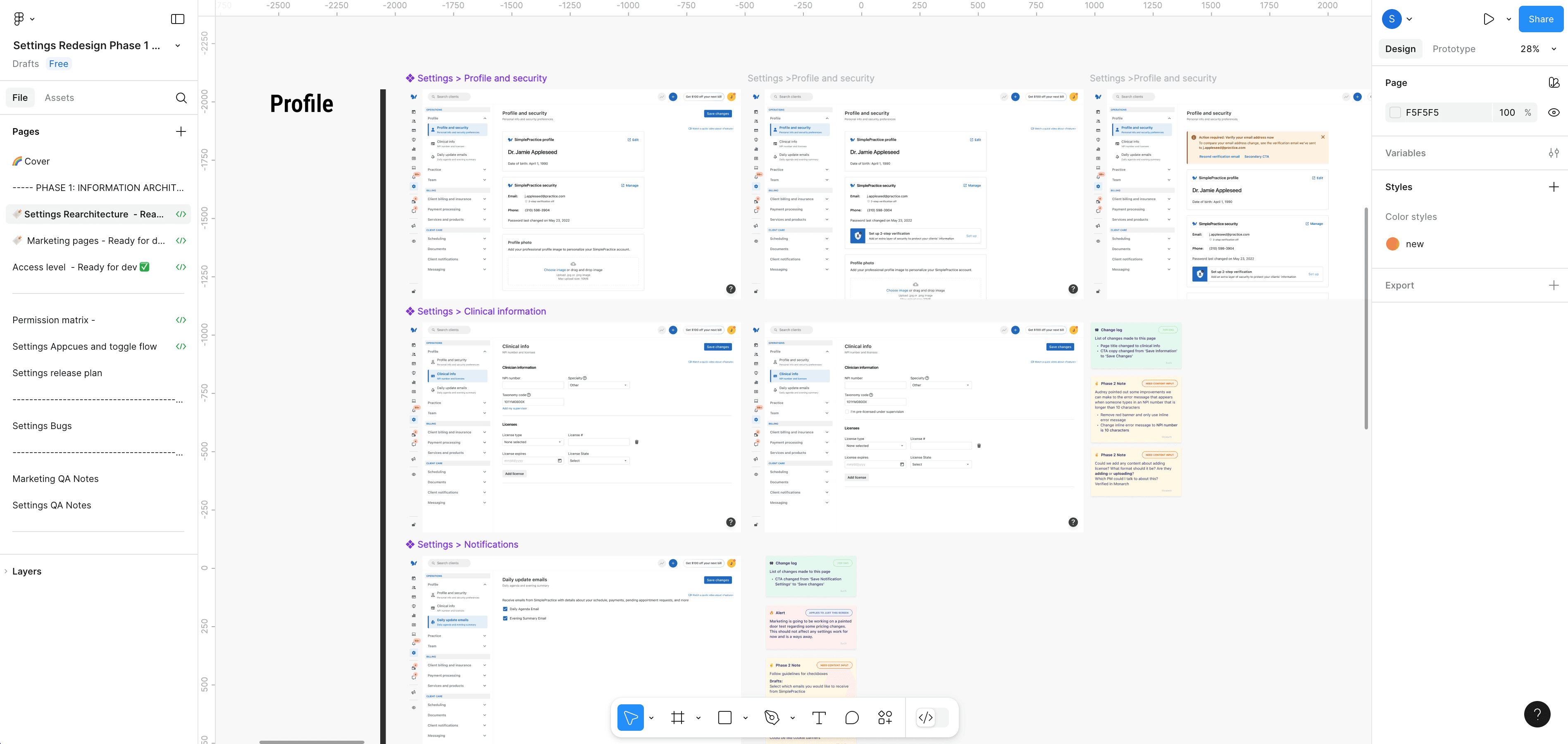
This discovery prompted iterations toward a simpler settings navigation
Navigation improvements
Workflow-based navigation
The number of sections was reduced from seven to three, aligning with clinician workflows: Operations, Billing, and Client Care.
Consolidated tabs
All tabs became standalone pages, easily accessible within the settings navigation. Page names were updated for clarity and improved discoverability.
Grouped navigation
Similar settings pages were grouped by function, simplifying navigation. These groups are expandable/collapsible within the menu. Icons and brief descriptions were added to each page for visual consistency and quick understanding.
Information improvements
Reorganized information for clarity Settings pages were restructured to group related items, enhancing navigation and clarity. Settings were relocated to relevant navigation groups. Content from related tabs was merged into single pages to reduce complexity. Where needed, tabs were split into multiple pages to ensure clarity and prevent information overload.
Solution testing showed that removing tabs and adding descriptions significantly improved usability
Workflow-based grouping hastened navigation
The new traditional navigation, a secondary menu next to the collapsed main nav, combined with clear workflow segregation, ensured easy discovery of settings.
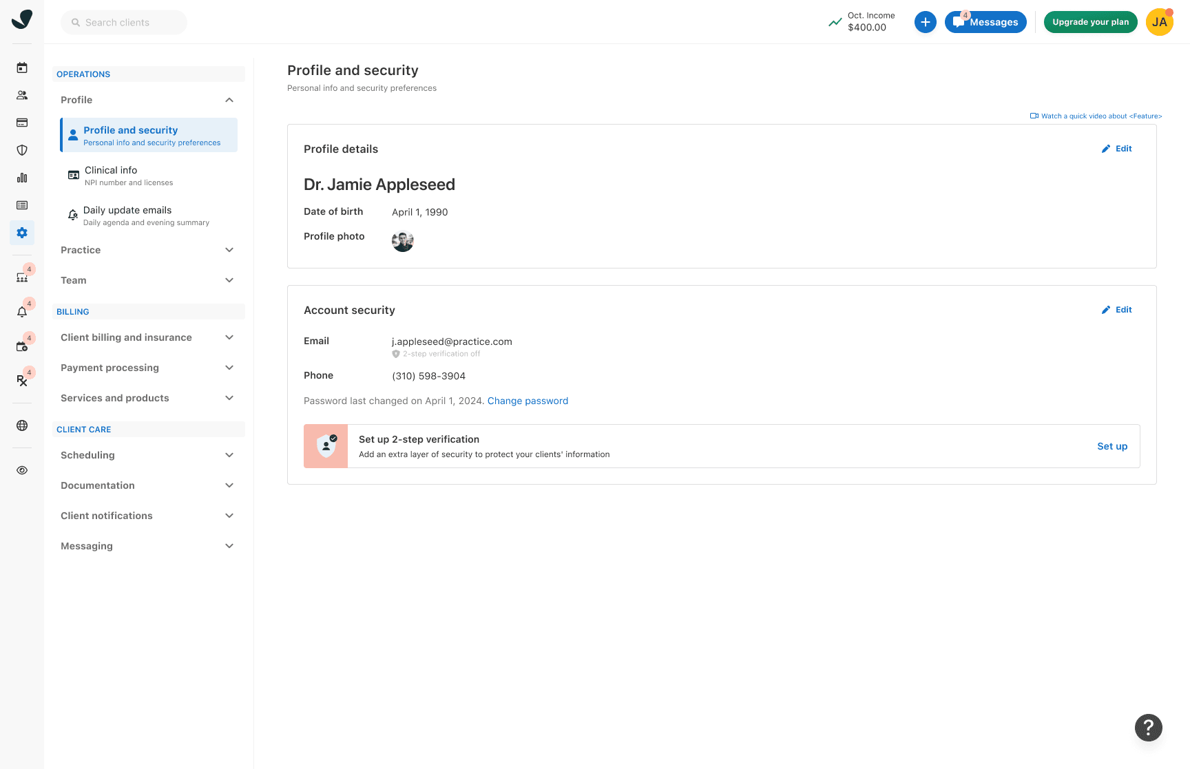
Clear names and descriptions improved page navigation
Adding names and descriptions to pages allowed users to understand content before clicking, further enhancing the experience.
Marketing perceived as a separate product
Testing revealed users viewed Marketing as a distinct product setup, explaining low adoption. Based on this, Marketing was moved to the main navigation with redesigned pages, providing clear entry and significantly increasing adoption.

The complex solution required a sensitive release to avoid disrupting user workflows
Users could toggle between old and new settings during the transition. To avoid sudden workflow disruptions with the sensitive settings area, the redesign was released over a month with advance notice, allowing users time to adapt.

To maintain usability and intuitiveness as features grew, principles were established
Settings are for controls, not primary information. Global settings should manage the product, not display essential operational information.
Keep global settings broad, local settings contextual. Global settings should impact the entire product and be less frequently accessed.
Avoid permission stacking. If a practice-wide permission is on, avoid requiring redundant service or client-level permissions. If necessary, clearly communicate related permissions.
Limit the number of settings. Offer enough control without overwhelming users.
Reuse information when possible. Avoid re-entry; auto-populate and ask for confirmation when necessary.
Only show relevant settings. Explain how to gain access to unavailable features; otherwise, hide them.
Enhanced settings and marketing dramatically improved user satisfaction. Customer support requests decreased by 90%, and quarterly active marketing viewers increased by 238%.
Let’s work together
Think I’d be a great fit for your team?